


yilu
Optimising PDP conversion by 200% — Travel Booking Platform
my role
Responsible for the Search / Results / Product Pages
setup
Bi-weekly cross-functional sprints
Time frame
Q3 2019
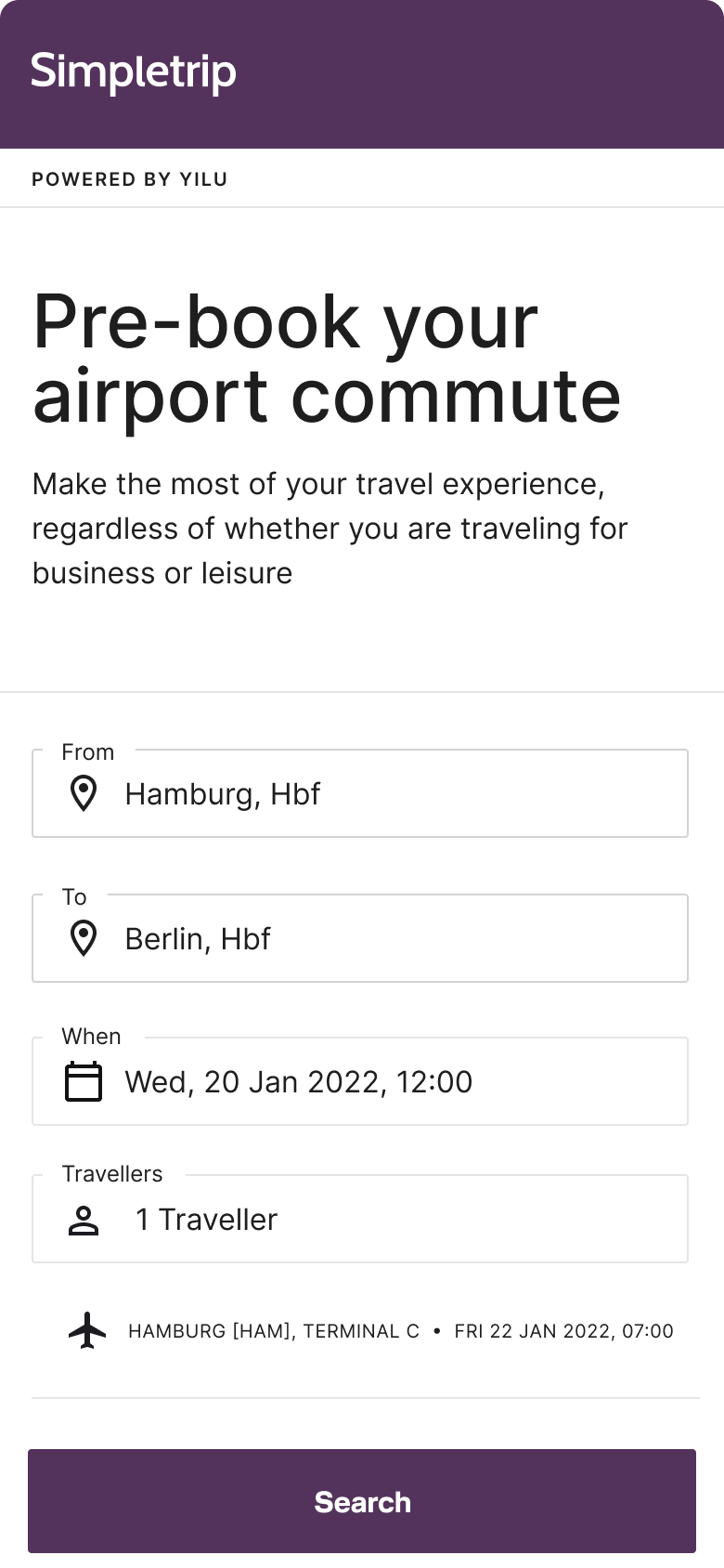
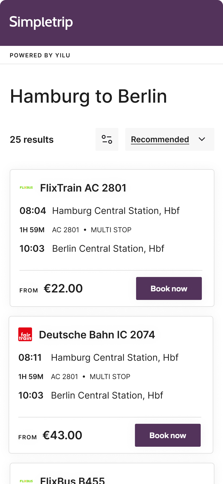
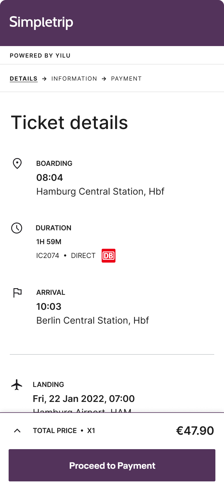
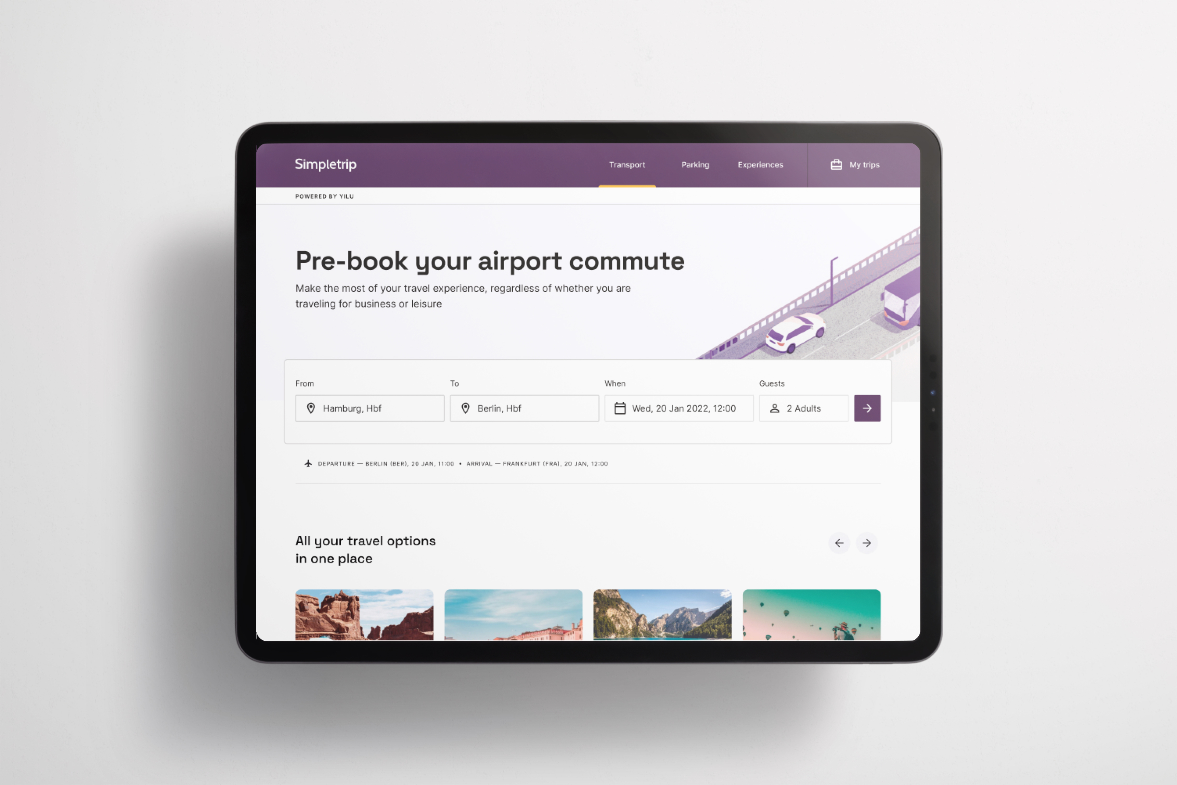
Yilu is a white-label travel platform powered by AI. Its modular design system allows for partner-specific customisations.

Problem
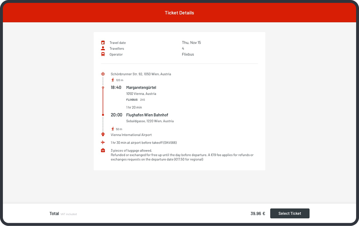
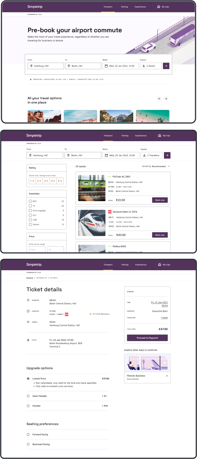
Missing key API based features, led to low PDP conversion. From a design perspective, it was challenging due to inconsistent data models, from different backend providers, requiring a unified approach on our end.
2.5%
Conversion from PDP to next step [personal details]
1.8%
Conversion from PDP to booking confirmation [bottom 20% vs benchmark]
38
SUS score puts our flow in the bottom 5% across the industry
Solution
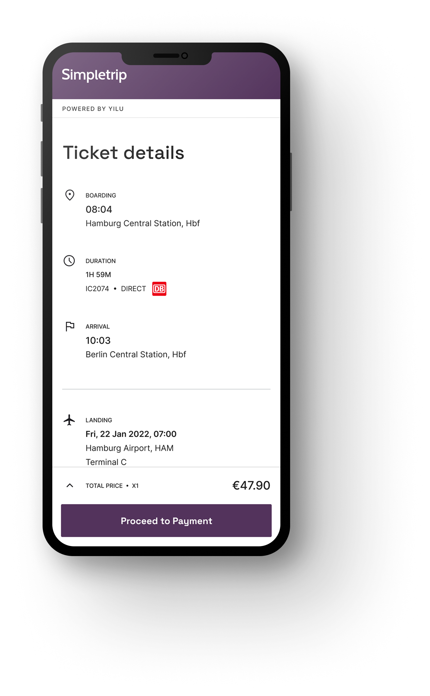
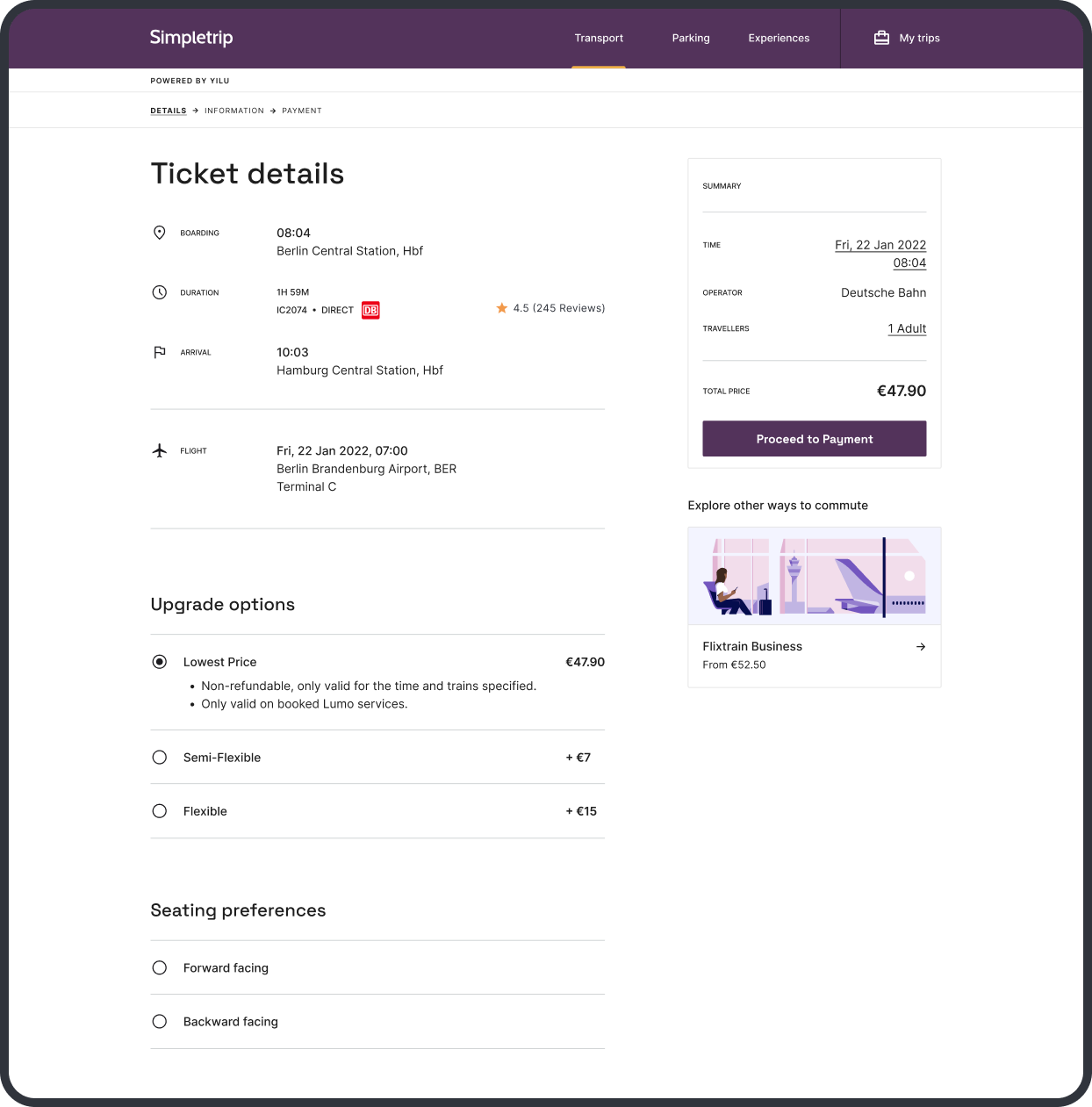
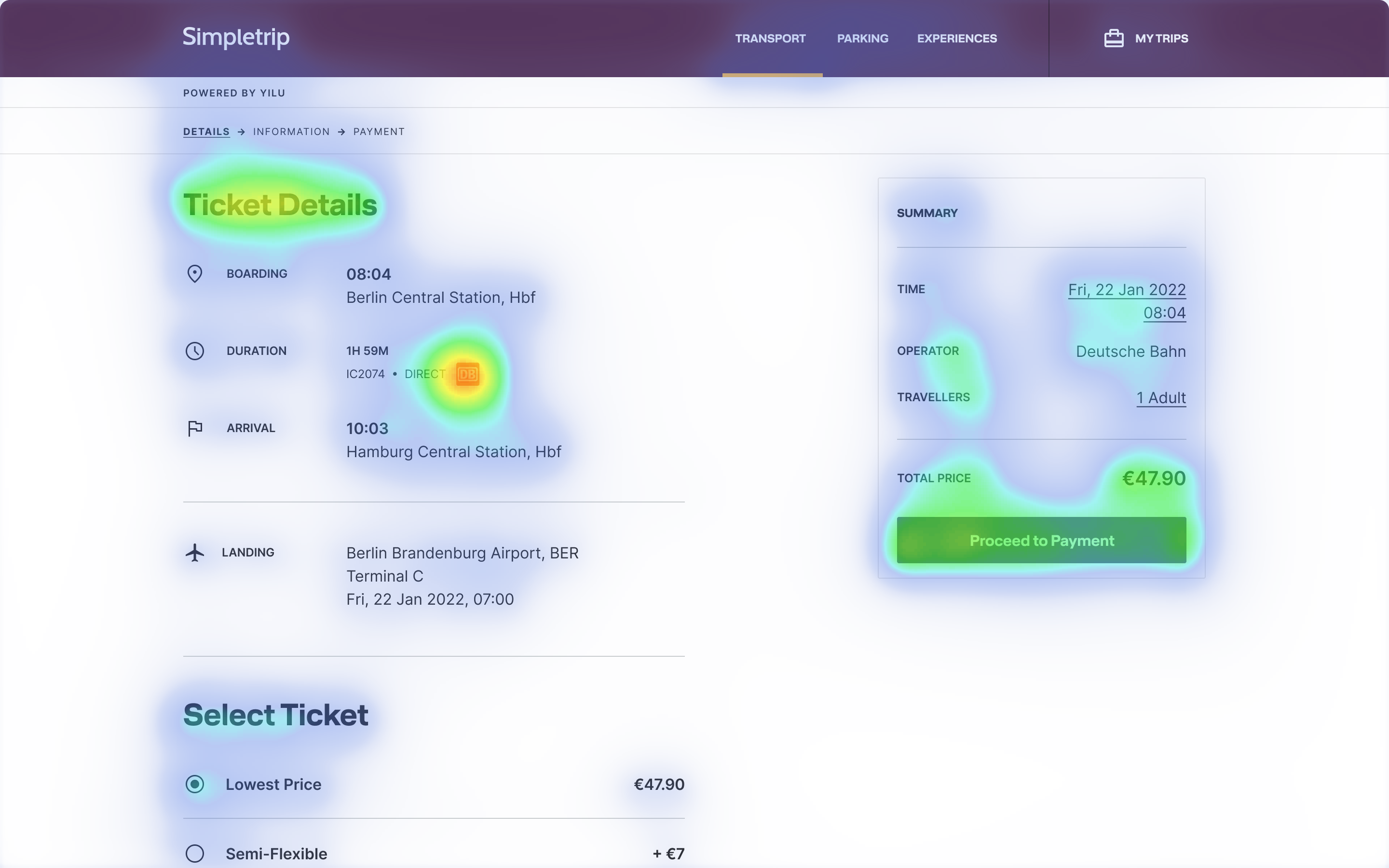
I mapped all providers and created a single data model, with fallbacks for missing or late data, resulting in a consistent and stable PDP, even when data wasn’t—boosting conversion by 200% and reducing cancellations.
7%
Conversion from PDP to next step [personal details]
4.5%
Conversion from PDP to booking confirmation
75
SUS score puts our flow in the top 20% across the industry
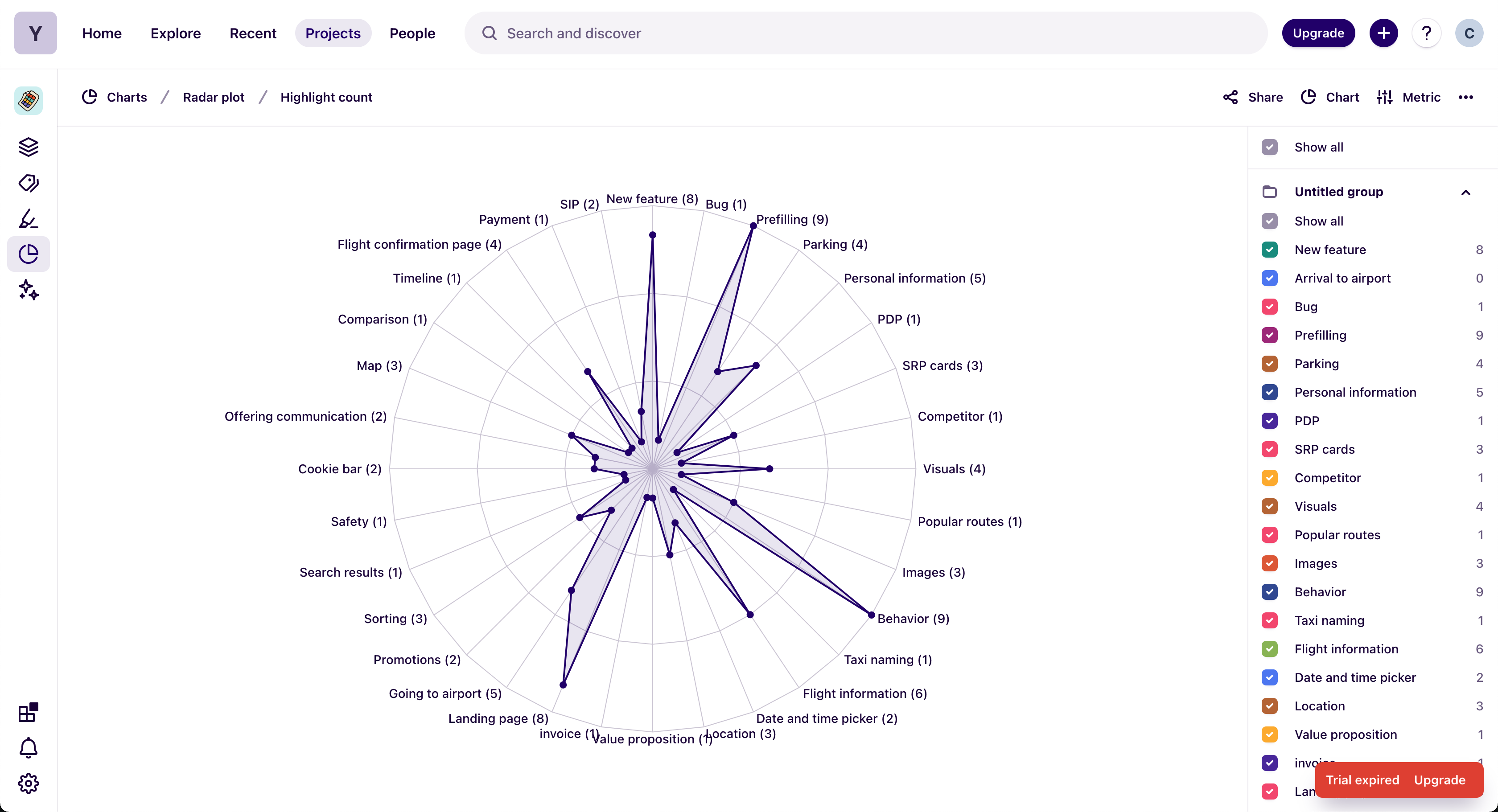
Initial Research
I interviewed stakeholders to understand constraints and goals, and analysed qual / quant data to uncover pains. Both perspectives resulted in a framed problem and aligned the team on the opportunities.
Pains
Information Clarity
- Key details (price, cancellation, inclusions) were buried or unclear
- Unclear differences between options (e.g., room types, ticket types)
- Ambiguous refund/cancellation info increased booking hesitation.
Trust & Credibility
- Inconsistent visuals and incomplete content led to distrust
- Lack of verified reviews, partner logos, or social proof
- Unbranded or white-label design reduced perceived reliability.
Decision Confidence
- Users struggled to compare similar offers or understand value differences
- Anxiety over making the “wrong” choice.
Gains
Information Clarity
- Clear, structured information hierarchy
- Transparent cancellation & refund terms displayed up front
- Consistent formatting for features and inclusions (e.g., amenities icons).
Trust & Credibility
- Added trust signals (partner branding, airline/hotel logos)
- High-quality imagery and verified content improved perceived legitimacy
- Standardized PDP layout across partners improved familiarity and trust.
Decision Confidence
- Clear value comparison between offers (e.g., side-by-side modules)
- Structured content reduced cognitive load
- Tooltips or collapsible sections provided optional detail for expert users.
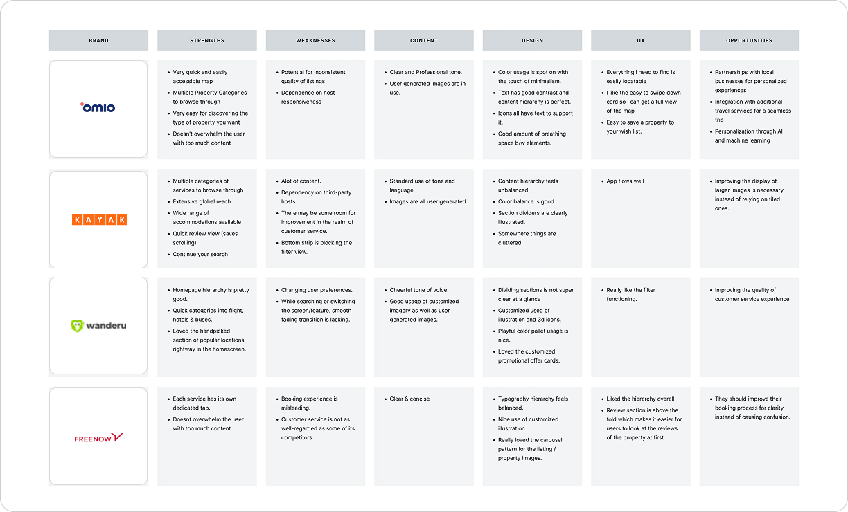
Competitive Analysis
Analysing competitors; strengths, weaknesses & opportunities.
Ideation
Stakeholders gathered ideas, enabling a goal-oriented approach. Focus was tailored content that for the E2E journey.
Guiding Principles

Seamless
Predictible and easy-to-use

Trusted
Eye level communication.

Simple
Minimalist design & fonctionality.

Predictible
We design simple & easy. No surprises.
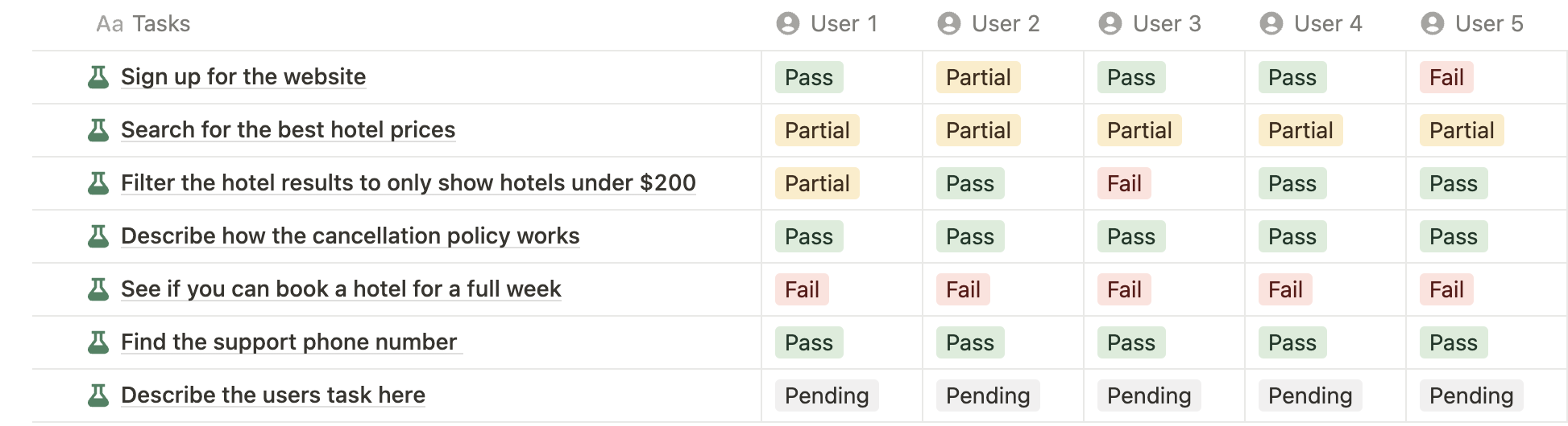
Testing
Testing results guided the ongoing redesign and highlighted the improved satisfaction achieved through the PDP restructure.

Release
Handoff implemented gradually based on prioritisation. Components were replaced with a new design system. Every release was A/B tested.
Conversion rate improved by 200% & SUS went from 38 to 72, allowing new features, partnerships and scalability.

Home
AutoScout24
ExpressSteuer
Yilu

yilu
Optimising PDP conversion by 200% — Travel Booking Platform
my role
Responsible for the Search / Results / Product Pages
setup
Bi-weekly cross-functional sprints
Time frame
Q3 2019
Yilu is a white-label travel platform powered by AI. Its modular design system allows for partner-specific customisations.

Problem
Missing key API based features, led to low PDP conversion. From a design perspective, it was challenging due to inconsistent data models, from different backend providers, requiring a unified approach on our end.
2.5%
Conversion from PDP to next step [personal details]
1.8%
Conversion from PDP to booking confirmation [bottom 20% vs benchmark]
38
SUS score puts our flow in the bottom 5% across the industry
Solution
I mapped all providers and created a single data model, with fallbacks for missing or late data, resulting in a consistent and stable PDP, even when data wasn’t—boosting conversion by 200% and reducing cancellations.
7%
Conversion from PDP to next step [personal details]
4.5%
Conversion from PDP to booking confirmation
75
SUS score puts our flow in the top 20% across the industry
Initial Research
I interviewed stakeholders to understand constraints and goals, and analysed qual / quant data to uncover pains. Both perspectives resulted in a framed problem and aligned the team on the opportunities.
Pains
Information Clarity
- Key details (price, cancellation, inclusions) were buried or unclear. - Unclear differences between options (e.g., room types, ticket types). - Ambiguous refund/cancellation info increased booking hesitation.
Trust & Credibility
- Inconsistent visuals and incomplete content led to distrust. - Lack of verified reviews, partner logos, or social proof. - Unbranded or white-label design reduced perceived reliability.
Decision Confidence
- Users struggled to compare similar offers or understand value differences. - Anxiety over making the “wrong” choice.
Gains
Information Clarity
+ Clear, structured information hierarchy. + Transparent cancellation & refund terms displayed up front. + Consistent formatting for features and inclusions (e.g., amenities icons).
Trust & Credibility
+ Added trust signals (partner branding, airline/hotel logos). + High-quality imagery and verified content improved perceived legitimacy. + Standardized PDP layout across partners improved familiarity and trust.
Decision Confidence
+ Clear value comparison between offers (e.g., side-by-side modules). + Structured content reduced cognitive load. + Tooltips or collapsible sections provided optional detail for expert users.
Competitive Analysis
Analysing direct competitors for strengths, weaknesses, and opportunities.
Ideation
Stakeholders gathered ideas, enabling a goal-oriented approach. Focus was personalised content that supports the E2E journey.
Guiding Principles
Seamless
Predictible and easy-to-use
Trusted
Eye level communication.
Simple
Minimalist design & fonctionality.
Predictible
We design simple & easy. No surprises.
Testing
Testing results guided the ongoing redesign and highlighted the improved satisfaction achieved through the PDP restructure.
Release
Prio based implementaion. Components were replaced with a new design system. Every release was A/B tested.


Conversion rate improved by 200% & SUS went from 38 to 72, allowing new features, partnerships and scalability.
Home
AutoScout24
ExpressSteuer
Yilu
yilu
Optimising PDP conversion by 200% — Travel Booking Platform
my role
Responsible for the Search / Results / Product Pages
setup
Cross-Functional / Bi-Weekly Sprints
Time frame
Q3 2019
Yilu is a white-label travel platform powered by AI. Its modular design system allows for partner-specific customisations.
Problem
Missing key API based features, led to low PDP conversion. From a design perspective, it was challenging due to inconsistent data models, from different backend providers, requiring a unified approach on our end.
2.5%
Conversion from PDP to next step [personal details]
1.8%
Conversion from PDP to booking confirmation [bottom 20% vs benchmark]
38
SUS score puts our flow in the bottom 5% across the industry
Solution
I mapped all providers and created a single data model, with fallbacks for missing or late data, resulting in a consistent and stable PDP, even when data wasn’t—boosting conversion by 200% and reducing cancellations.
7%
Conversion from PDP to next step [personal details]
4.5%
Conversion from PDP to booking confirmation
75
SUS score puts our flow in the top 20% across the industry
Initial Research
I interviewed stakeholders to understand constraints and goals, and analysed qual / quant data to uncover pains. Both perspectives resulted in a framed problem and aligned the team on the opportunities.
Pains
Information Clarity
- Key details (price, cancellation, inclusions) were buried or unclear. - Unclear differences between options (e.g., room types, ticket types). - Ambiguous refund/cancellation info increased booking hesitation.
Trust & Credibility
- Inconsistent visuals and incomplete content led to distrust. - Lack of verified reviews, partner logos, or social proof. - Unbranded or white-label design reduced perceived reliability.
Decision Confidence
- Users struggled to compare similar offers or understand value differences. - Anxiety over making the “wrong” choice.
Gains
Information Clarity
+ Clear, structured information hierarchy. + Transparent cancellation & refund terms displayed up front. + Consistent formatting for features and inclusions (e.g., amenities icons).
Trust & Credibility
+ Added trust signals (partner branding, airline/hotel logos). + High-quality imagery and verified content improved perceived legitimacy. + Standardized PDP layout across partners improved familiarity and trust.
Decision Confidence
+ Clear value comparison between offers (e.g., side-by-side modules). + Structured content reduced cognitive load. + Tooltips or collapsible sections provided optional detail for expert users.
Competitive Analysis
Analysing direct competitors for strengths, weaknesses, and opportunities.
Ideation
Stakeholders gathered ideas, enabling a goal-oriented approach. Focus was personalised content that supports the E2E journey.
Guiding Principles
Seamless
We feel natural & effortless.
Trusted
Eye level communication.
Simple
Minimalist design & functionality.
Predictable
We design simple & easy. No surprises.
Testing
Testing results guided the ongoing redesign and highlighted the improved satisfaction achieved through the PDP restructure.
Release
Prio based implementation. Components were replaced with a new design system. Every release was A/B tested.

Conversion rate improved by 200% & SUS went from 38 to 72, allowing new features, partnerships and scalability.